We sat down to talk all things interior design with Rufus Knight
From his work on the iconic Lonely boutique to Minotti’s sumptuous showroom, Auckland-based Interior Designer, Rufus Knight, has quickly carved out a niche for himself. We chatted to the talented designer while he was briefly in the country to talk all things design and discovered following your heart pays off in creative spades.
You’re a bit of a hot topic in the interior design world. When did you realise interior design was for you?
My interest in interiors was mostly just intuitive. During my studies I was more interested in things like fashion and art and music and, at the time, saw more possibilities for exploring these interests through Interior Design than I did in other design disciplines.
I remember being very taken by the Modernist American canon of Judd, Serra, O’Keeffe, Matta-Clarke, et al. and realizing, although it was classified as art, the works had a kind of interior dimension. I distinctly remember reading an essay by Art Historian Clare Bishop called ‘Heightened Perception’ that drew parallels between work by artists like Carsten Höller and Olafur Eliasson and its highly atmospheric qualities, interiority and effects on the senses.
How does fashion, music, art and other cultural design elements influence your work?
In terms of inspiration, as I mentioned, the American and European Modernist art canon is a really important point of departure for me. In parallel to this I worked in retail through the course of my studies and that experience is fundamental as many of our first projects were mostly retail focused. Working at Zambesi also exposed me first-hand to designers like Rick Owens, Raf Simons, Martin Margiela, Jun Takahashi, An Vandevorst, and Veronique Branquinho – being in my late-teens at this time the impressions were abstract but incredibly visceral and helped shape my early thinking about interiors and interiority.
After I finished university, I became really interested in foreign cinema - I’ve always wanted to design sets and stages like Hans Dieter Schaal, Kurt Schwitters, or Hermann Warm. However, by and large, my biggest influence from outside the architecture and design spheres has been New Zealand’s Nationalist canon of painting, literature, and photography.
I’m deeply interested in Colin McCahon, Gretchen Albrecht, Ralph Hotere, James K. Baxter, Julian Daspher, and L.Budd. The more I read about these artists and writers, the more I started to understand myself and how a kind of creative psyche of New Zealand developed through these people’s explorations.
In terms of influence, I am inspired by people who understand the importance of place but maintain a global outlook… and also those that are receptive to cultural identities and diversity within their field. I feel privileged to have worked with many studios and individuals which, I feel, embody some or all of these characteristics; Fearon Hay Architects, Alt Group, Fisher & Paykel, Lonely,Aēsop, Les Mills New Zealand, Auckland Council Arts and Culture, Benesse Foundation.
What is your personal design philosophy?
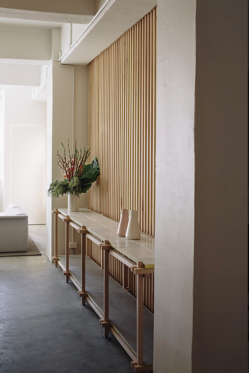
My personal design philosophy centres around three main themes; material response, New Zealand’s indigenous arts and crafts, and the exploration of design history.
I am keenly interested in materiality – in particular New Zealand’s indigenous materials – and its ability to create human and sensory responses and communicate narrative. A project entitled ‘Te Koha’ that I completed for the New Zealand Institute of Architects participation in the 2016 Venice Architecture Biennale, established a way to work that started to tie together thematic ideas around materiality about how to tell a sophisticated ‘New Zealand story’ through a spatial medium.
The design strategy for Biennale space was to work with innovative New Zealand-based suppliers and locally sourced materials in order to develop an identity for the room that was sympathetic to the richness and tactility of New Zealand’s natural landscape. Examples of this in ‘Te Koha’ were the woven Harakeke (flax) floor covering, the native RewaRewa (Honeysuckle) timber furniture, and the wūru(wool) fabric drops from the sustainably sourced Perendale breed located in Akaroa on New Zealand’s South Island… Referencing New Zealand’s indigenous art and craft histories is a developing interest that informs my creative practice.
Can you explain how your interest in materiality affects your design?
This was something that working for Vincent at Van Duysen Architects in Antwerp helped me to develop. Belgian design culture has an incredible respect for materiality and a highly developed sense of its application within the design process – regardless of whether its fashion, architecture, or product design.
When working in Antwerp, it was interesting to get some perspective on New Zealand’s design culture and I wondered why materiality wasn’t celebrated in the same way here. Since I returned back to New Zealand, I have been engaged in a number of workshops and projects to explore the idea of materiality within design and its explicit relationship to whenua in this country.
You designed the stunning boutique for iconic NZ retail brand, Lonely, how did you reflect the strong messaging of the brand into the space?
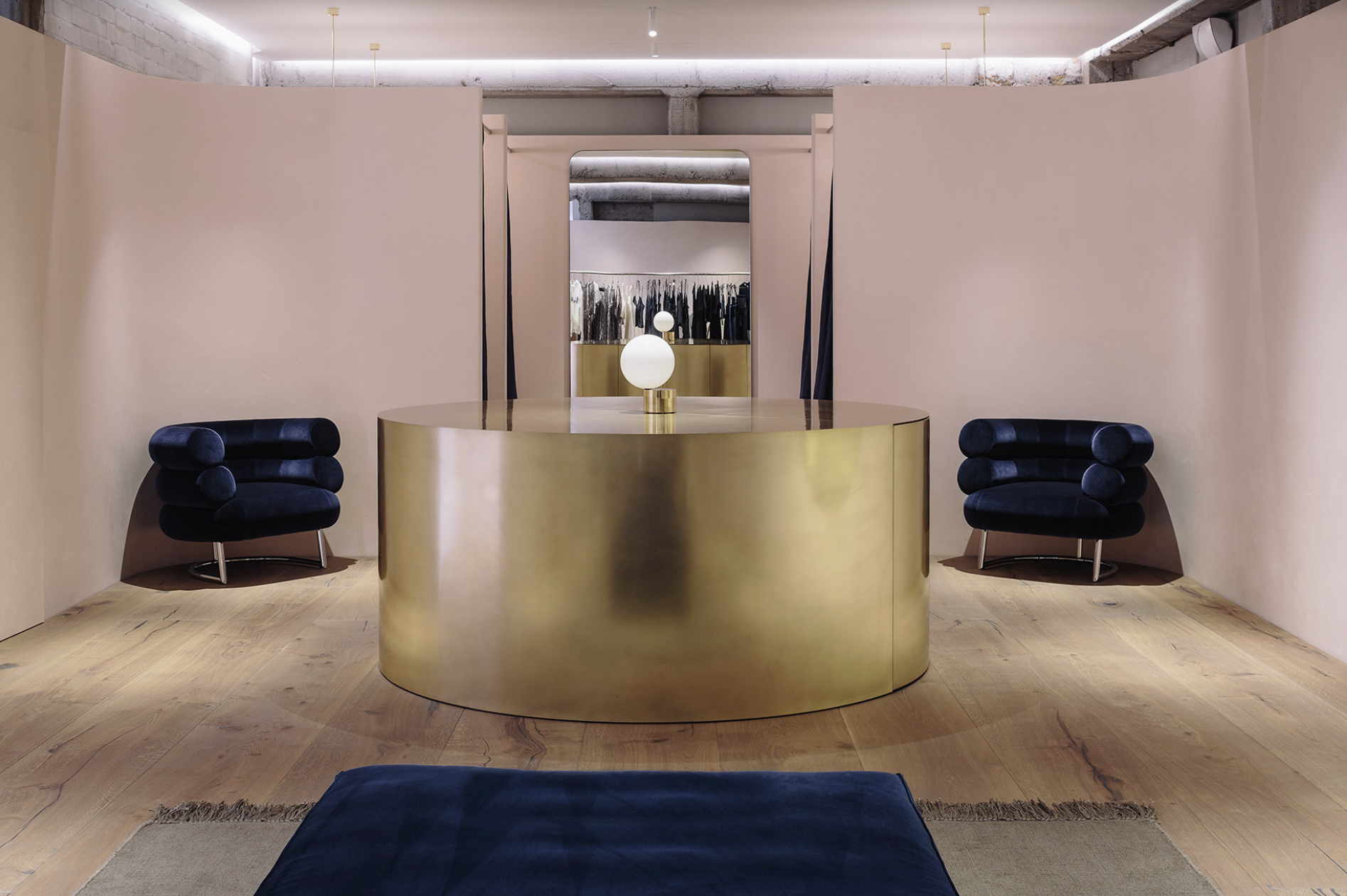
My work with Lonely began five years ago when I was asked to design their first flagship store in Ponsonby, Auckland. Through their approach to marketing and campaign imagery, Lonely displays a refreshing celebration of diversity and empowerment within a highly commercialized world of womens’ wear and lingerie. It was imperative that the stores reflect the youthful nature of the brand and express this emphasis on creativity and inclusivity.
Although subtle, a critical aspect of my interior design work with Lonely is being a vehicle to explore objects designed by women and introduce female design histories to theLonely customer. This consideration was imperative when thinking about how the stores would look, feel, and function and the three flagship stores across New Zealand have aimed to explore these female design histories in which the concept has been flexible enough to grow with brand as their retail model has evolved.
Telling a female design story has remained at the forefront of my approach – from sourcing Charlotte Perriand's' Méribel 523' stools for dressing rooms and Eileen Gray’s ‘Bibendum’ chairs for the shopfloor, to working with local creative females to supply floor coverings, upholstery, and textiles, to specially commissioned bronze fixings from New Zealand artist Kate Newby – this approach offers me strong parameters in which to design and aims to strengthen Lonely’s values of creativity and empowerment.
What well known brand or space in New Zealand would you love to work on given the chance?
I’d like to do a project in Ohakune or around the Central Plateau where I grew up.
You have your own successful interior design practice, Knight Associates. How did your career evolve to this point?
After my studies at Victoria University's School of Architecture and Design in Wellington, I worked with Fearon Hay Architects in Auckland for five years. Following that I worked for Vincent Van Duysen Architects in Antwerp for a short period then once I returned to New Zealand, I started Knight Associates in 2016. The decision to open my own office was also reasonably intuitive – just a question of time and place. I didn’t question whether it was a good decision or not; all I knew was that I had enquiry and interest in my approach and that I was, perhaps, contributing something unique to the design community. It certainly didn’t feel momentous but the growth and development over the last four years have been very rewarding.
Your work seems to pull inspiration from design history yet creatively craft your own stamp… how do you find the perfect balance?
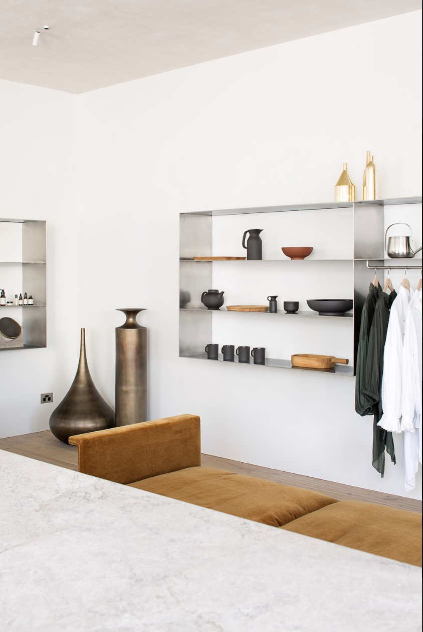
That was something that I was exposed to working at the Van Duysen office. Vincent is the expert at reinterpreting traditional and classic tropes through a modernist lens, and this was an approach that had previously shaped my ideas about what constituted strong interior design. To observe this first-hand was invaluable. The approach of the office, which was based around representing very classic-often specifically Belgian-forms and crafts through reductive aesthetic principals was pertinent to me. It made me question what New Zealand interiors could offer with a similar approach and what interior design meant within the cultures of the South Pacific.
When you take on a big project, is it all consuming?
Absolutely. Especially during the ideation of the concept and ensuring the project has strong conceptual foundations. As our studio has grown, we have more voices in the design process with a wide variety of skill sets and the output is stronger for it. The design process, personally, will always be all-consuming but having a strong team in the office makes the process richer, more complex, and more rewarding.
What project has given you the greatest satisfaction/pride thus far?
Building a team and creating an office culture that people want to be part of has been the most satisfying ‘project’ so far. I know that I have a lot more to give creatively and my aesthetic has yet to mature, but I’m really content with the work I’ve done to date and the impact it’s had in New Zealand. Creating an environment where design, creativity, and well being is unconditionally supported is my overarching goal.
Can you tell us the work you’ve been doing overseas?
Since establishing the practice we’ve worked on a number of overseas projects beginning with our participation in the 2016 Venice Architectural Biennale, which lead to exhibition designs at Salone del Mobile Milan and ICFF New York, in 2016 and 2017 respectively. Last year we completed two fitouts in New York and have projects lined up this year in Los Angeles, London, and Vancouver which is exciting. More than anything else I think we have established our practice at a time where many New Zealand companies are becoming globally relevant and setting their sights on international expansion. It’s humbling that these companies want to work with us when they are entering into new and highly competitive markets.
Does colour play a big role in your overall practice, or is that simply a byproduct from your preference of materiality?
Personally, I find colour one of the most difficult things to master within interior practice. Granted that many of our spaces are more neutral in tone, colour is usually applied in monochromatic fashion or in a singular ‘block’. Two references I always consult when I am stumped on how to introduce colour are Josef Albers 1963 publication ‘Interaction of Colour’ and anything by Christian Liaigre who, I believe,has the most sophisticated and most contemporary understanding of harmony,contrast, and tone.

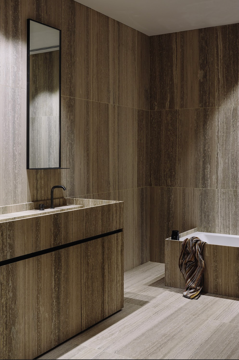
A lot of your projects seem to evoke warmth, luxury and a sense of calm. Do you have some sort of secret design algorithm to achieve this?
I don’t think there is a formula, but I think the creation of certain atmospheres is empiric – you first have to experience spaces that exhibit these qualities to know what you want to achieve. More often, clients describe a feeling of a space they have experienced and want to re-create rather than the material detail or spatial configuration. Creating ‘atmosphere’ is somewhat like Action Painting – spontaneous motion that draws from the subconscious without rationalization. You just have to feel it.
How do you balance your most ambitious creative dreams and ideas with business decisions… do you follow your heart or your head?
I make all my business decisions with my most ambitious creative dreams in mind. I always follow the heart.
Interview & words by AMBER BAKER


