Collette brings the Italian Riviera to Specsavers for her collaborations ten year anniversary
Australian fashion designer Collette Dinnigan is no stranger to the wonders of design, and after ten years of collaboration with iconic optometrist brand, Specsavers, a limited edition collection of eyewear to celebrate only made sense. Inspired by the Italian Riviera, the newest CD x Specsavers collection features bold, oversized frames, embellished details and the iconic Collette Dinnnigan bee motif. We had the opportunity to speak to the maker herself, chatting about the collection, how she channelled her identity into the designs, and what’s in the works for her next.
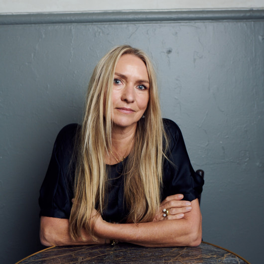
How did you begin in the fashion industry?
I went to Wellington Polytech and did a Fashion Design course. I then moved to Australia where I worked for a couple of companies, and then I worked at the ABC Television Costume department. I then ended up starting to make my own lingerie! I then went to loungewear and then outerwear, and then I took it to Paris!
That sounds super organic!
It was actually! It wasn't about dreaming of being in Paris, it was about the stores that wanted me to go there and do a show so they could see how to put all my clothes together. It definitely wasn't my dream, but when having done it, it's pretty great!
What was the inspiration behind your collaboration with Specsavers and how did it derive?
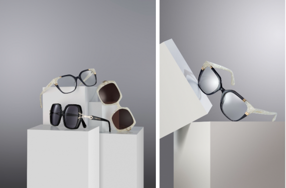
I had been living in Italy for 2-3 years and came back through Covid. I was asked to do the 10-year collection, which was very much based on the Italian Riviera and that whole glam of dressing up and going out for lunch on a Sunday. I just love the idea of celebrating life and family and glamour. It’s also kind of an ode to the 90s-2000s and the heyday of my fashion collections just before I stopped designing. So I guess it’s going back there a bit to where everything’s bolder and brighter
With such an incredible brand behind you, how did you channel your own brand and identity into your collaboration?
There's always something a bit bold and cheeky and feminine - it's very fashion-focused. It's just always been an extension of what I do really.
Going into the design process, were there design features you knew you had to include?
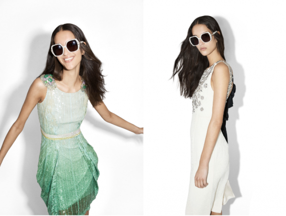
Because it’s a celebration I wanted to add some little diamontes on the sides of the wings and to make the glasses feel important and opulent. It’s about being noticed, it’s not about being discreet.
How did it differ from fashion and interior design?
When I'm doing interior it’s always the same proportions and contrast. With the glasses, the colours are very different. My favourite colour is green so I'll mix greens and pink or reds. You start with colour and shape and things you want to highlight and then you build a story around it.
Finally, I know it’s a hard question to answer, but if you could choose one style in your collection, what would it be and why?
It would definitely be the black sunglasses because I think they remind me of meeting an iconic Italian. I also think they're very fun and ‘look at me’. They've got a feel for life, they're bold, and they can be polarised too.
Anything exciting in the works?
I have recently launched my home fragrance collection, which has been exciting. Next year, I'll be launching a book and I've been working on a lot of interior projects and different things.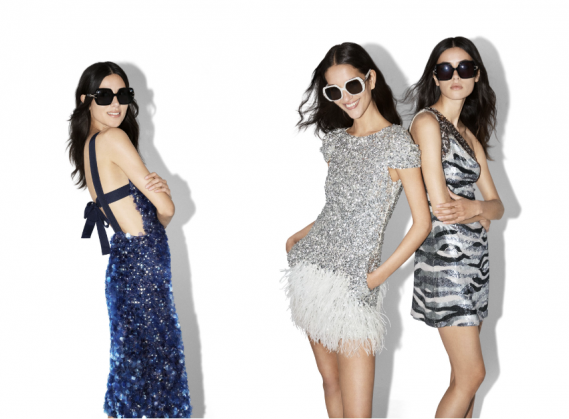 Quick Fire Questions:
Blue light or sunglasses?
Sunglasses
Acetate frame or metal frame?
Acetate
Classic design or bold and fun?
Bold and fun


